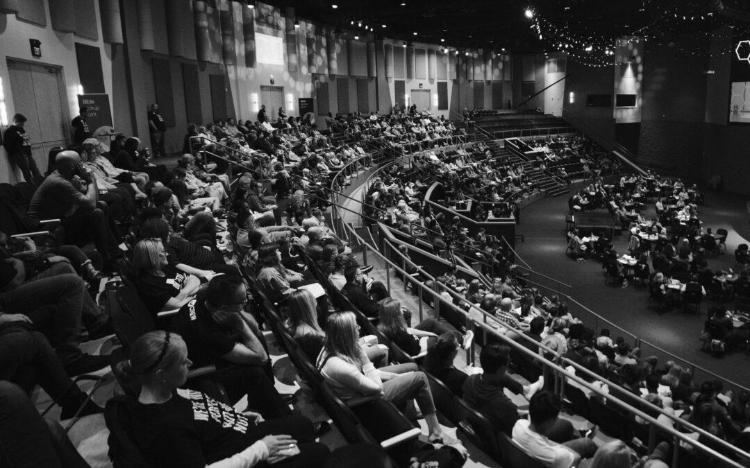
The Multiply Conference is a local Colorado, Front Range conference and it was important to bring the Colorado feel into the logo design. It was important to create a flexible design that worked with multiple mediums both digital and print.
A mono color palette fit this project’s desire to be flexible and fit the local Colorado feel.


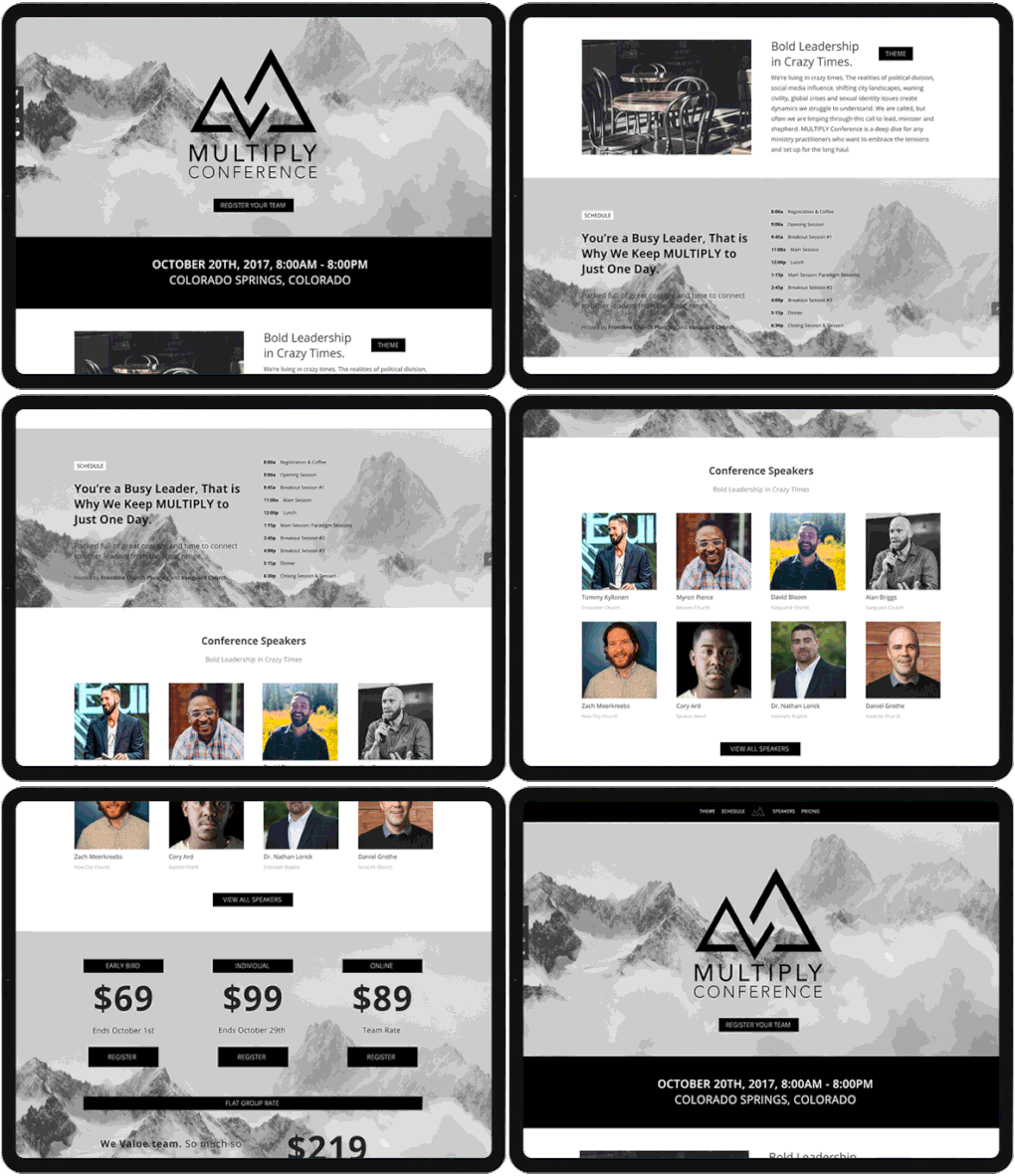
It can be difficult to bring the emotion of a Brand to life with printed collateral. We effectively brought the Classic, Clean, and Professional feel to life to reach their demographic through multiple mediums.
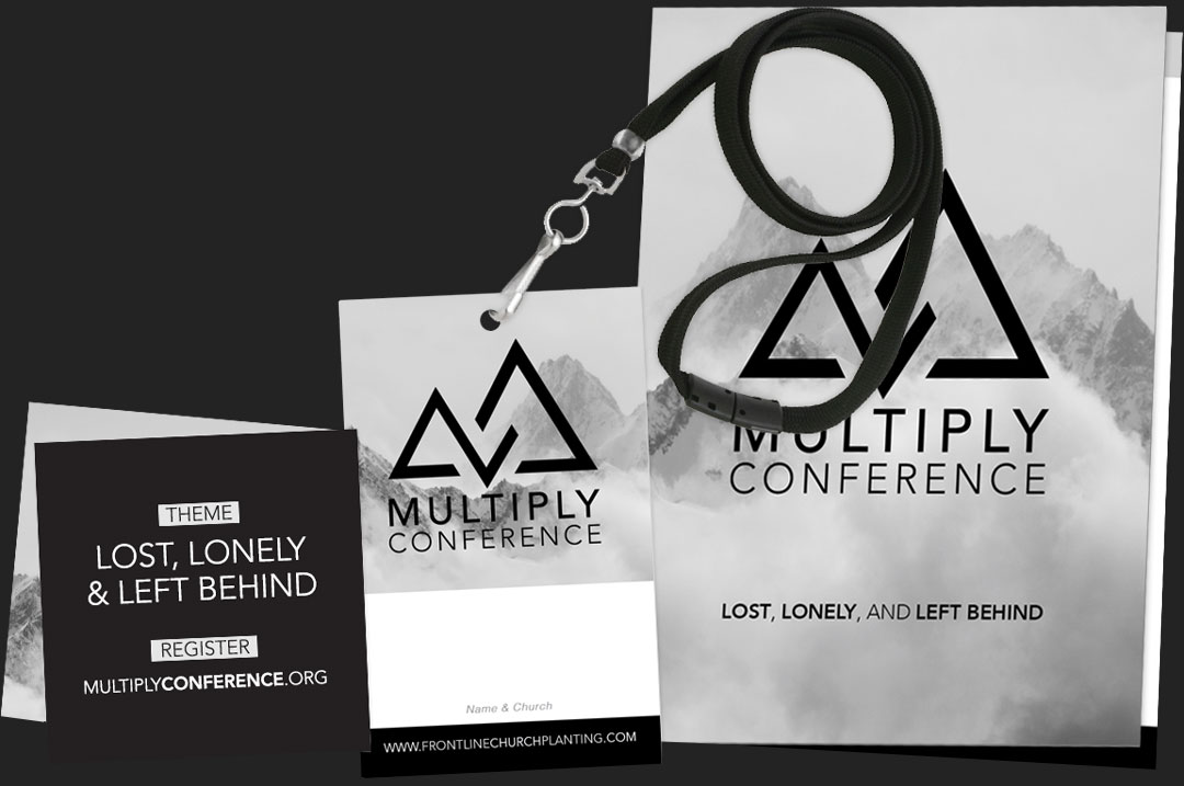
It can be difficult to bring the emotion of a Brand to life with printed collateral. We effectively brought the Classic, Clean, and Professional feel to life to reach their demographic through multiple mediums.
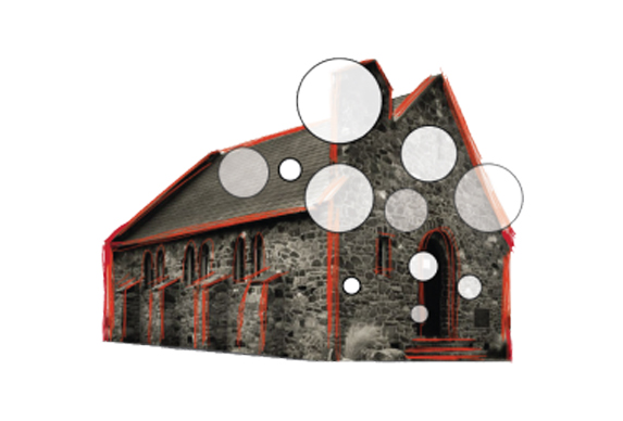
Hill City Church
