
Family Business Reimagined
A 20-year-old Family Business wanting to make a new name for themselves and reach into the professional market while remembering the past.
Brand Development
Print Collateral
Web Presence
The Foundation, the Brand
The groundwork on which everything is built: the brand. We began by looking to the past and building the vision for the future to narrow down a concept that is best suited the company.
Classic
Clean
Professional
Old Logo
Concept Design
The Logo
The mark for Tall Pines Builders was inspired by the tall pines found around the birthplace of the business. Here the mark is stylized in a pen-stroke quality and appears in a lively, vibrant green allowing the overall logo to seem approachable and yet clean.
Fonts & Things
Typography is another major player in the branding. Here are a few of the sample sizes and weights of the typography used.
HEADER TYPOGRAPHY
Baskerville Old Face
Satellite
BODY TYPOGRAPHY
Open Sans
Logo on Dark
Mono Logo

Logo Mark
Print Collateral
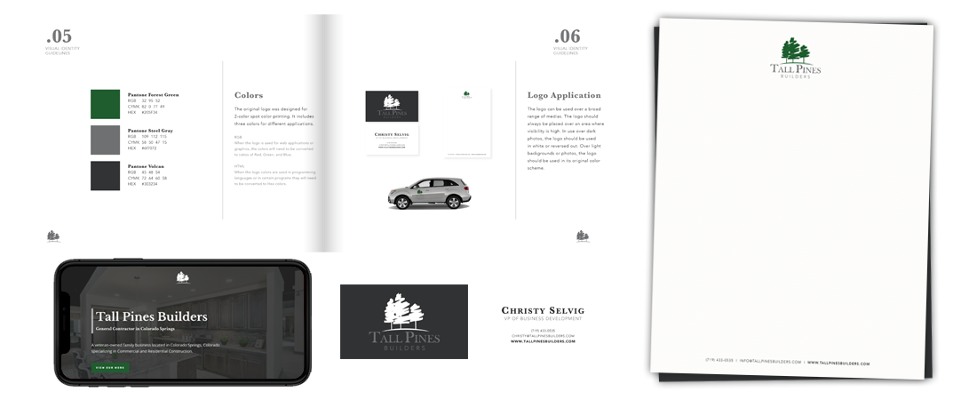
It can be difficult to bring the emotion of a Brand to life with printed collateral. We effectively brought the Classic, Clean, and Professional feel to life to reach their demographic through multiple mediums.
Web Presence
Placement is a key part of design, and everything has to follow a logical order. We take UI and UX very seriously, and always give our all when approaching these tasks.
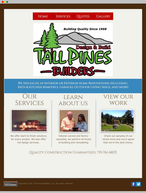
Old Site
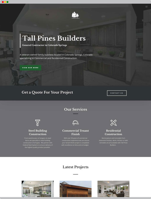
Branded Site
VIEW NEXT PROJECT
The Relational Company
